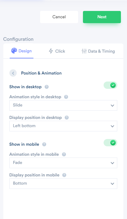
Based on our research, we found that the below default works best.
Show in Desktop:
Animation style: Slider animation is the best one.
Display position: Left Bottom position is the right choice.
Show in Mobile:
Animation style: Fade animation is the best one,
Display position: Here, the Bottom part is the right choice. Mostly top side website having a logo & menu. So, the Bottom works best in most cases.

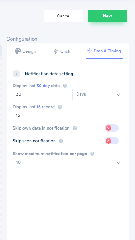
Data Rules:
By default, we show the last 30 days data & it will have a limit like show only the previous 15 records. Even if it has more than 15 records, it will show only the latest 15 records.
If you don't want to show visitors' own data into the notification, you can enable "Skip own data in the notification." It is up to you. By default, It is off.
Skip seen notification allows you to stop displaying the same data, which has earlier been seen by the visitor for a specific time duration. Let's say you have created one conversion notification & the visitor has seen one data "john just signed up" at the home page then visits the pricing page where he/she will not see "John" data again during a specific time duration.
By default, It is off.
Select the "show maximum notification per page" option to set the limit, like show ten notifications per page(reload).
By default, It is showing 10 data per page.

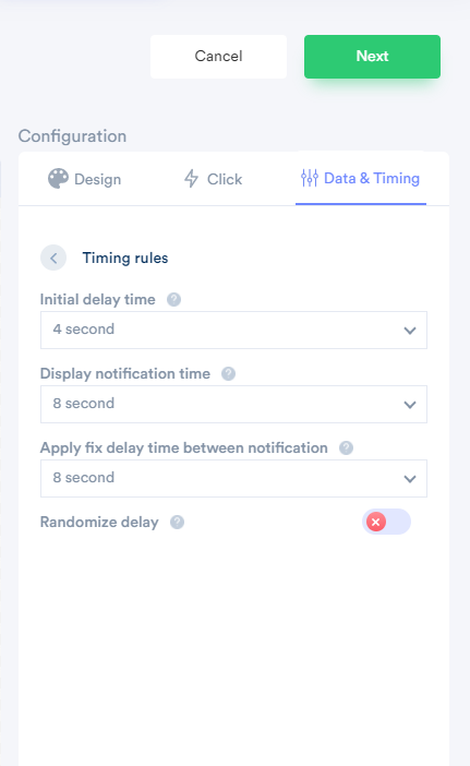
Timing Rules:
By default,
The initial delay timing option is 4 seconds. It means once a visitor lands on your website after 4 seconds, it will start showing notifications.
The display notification time is 8 seconds. It means one notification period is 8 seconds.
Delay time between two notification times allows you to set a time duration between two notifications. It is also for 8 seconds.
If you don't want to set a fixed delay between two notifications, then use the Randomize delay option. It will automatically generate random time between 2 to 12 seconds whenever the page gets reload & apply.

For more queries, reach us at [email protected] or on live chat.
